
1925 Scott B9 2c (+3c) green & orange
"Arms of North Brabant"
Quick HistoryQueen Wilhelmina of the Netherlands reigned from 1890-1948. When she abdicated in 1948, because of advanced age, in favor of her daughter Juliana, she was the only remaining survivor of the 16 European kings and one queen that were on the throne when she had her coronation in 1898.

Wilhelmina wearing her coronation robe in 1898
She was one tough queen. Churchill is said to have described her as the as the only "real man" among the governments-in-exile in London.
She had ambivalent attitudes toward the United Kingdom. She resented the annexation of the Republics of Transvaal and the Orange Free State in the Boer War. The Boers, of course, were Dutch colonists.
At the end of WWI, Kaiser Wilhelm fled to the Netherlands, where he was granted political asylum, partially due to familial linkage with Queen Wilhelmina. When the Allies still tried to apprehend him, the Queen called in the ambassadors, and lectured them on the rights of asylum.
On May 10, 1940, Germany invaded the Netherlands, and the Queen and her family retreated to the United Kingdom at the invitation of King George VI, where she took charge of the Dutch government in exile. She was the figurehead of resistance for the Dutch, as she broadcast messages to the people over Radio Oranje.
The many stamp images and issues of Wilhelmina found for the Netherlands are now, one hopes, visualized with real flesh and bones.

1927 Scott B22 5c (+3c) olive green & yellow
"Arms of Groningen"
Into the Deep BlueThis blog post will feature a sample of the semipostal issues of the Netherlands between the years 1906-1934.
Semipostals, stamps where one pays a premium over the printed postal denomination, are popular in many countries as a means to raise funds for charities, or for special projects. The United States has never issued semipostals. Consequently, the U.S. collector is not all that familiar or comfortable with them. Scott places them in the "Back of the Book" section, rather than among the "regular" issues. They are viewed as something "optional" to collect. And true, by their very nature, they will be more expensive for the collector to accumulate than regular issues. Most Big Blue albums reasonably filled, will still have mostly empty pages for the semipostals.
And semipostals are often the most strikingly designed stamps for a country. Witness the semipostals of the Netherlands:- well, let's look for ourselves. ;-)
A closer look at the stamps and issues
100 Cents = 1 Gulden

The first three stamp semipostal issue for the Netherlands was produced in 1906, and the surtax aided the Society for the Prevention of Tuberculosis. It has four symbolical designs featuring the four chief means for combating Tuberculosis: namely, light, water, air, and food. Many of the sanatoriums in Europe were located in light airy places- such as mountain retreats. (Witness The Magic Mountain - Der Zauberberg- by Thomas Mann.)
Even today, Tuberculosis requires a multi-chemical cocktail for treatment to prevent resistant strains from emerging.
Note this particular stamp has an "Amsterdam 31,07 10-12N" postmark? These are CTO varieties, and are worth much less
Even today, Tuberculosis requires a multi-chemical cocktail for treatment to prevent resistant strains from emerging.
Note this particular stamp has an "Amsterdam 31,07 10-12N" postmark? These are CTO varieties, and are worth much less

1923 Scott B4 2c (+5c) violet blue
"Symbolical of Charity"
The second set of semipostals-two stamps- were not produced until 1923, and were for the benefit of charity. I love this design, where the supplicants and the almsgiver lean toward each other.
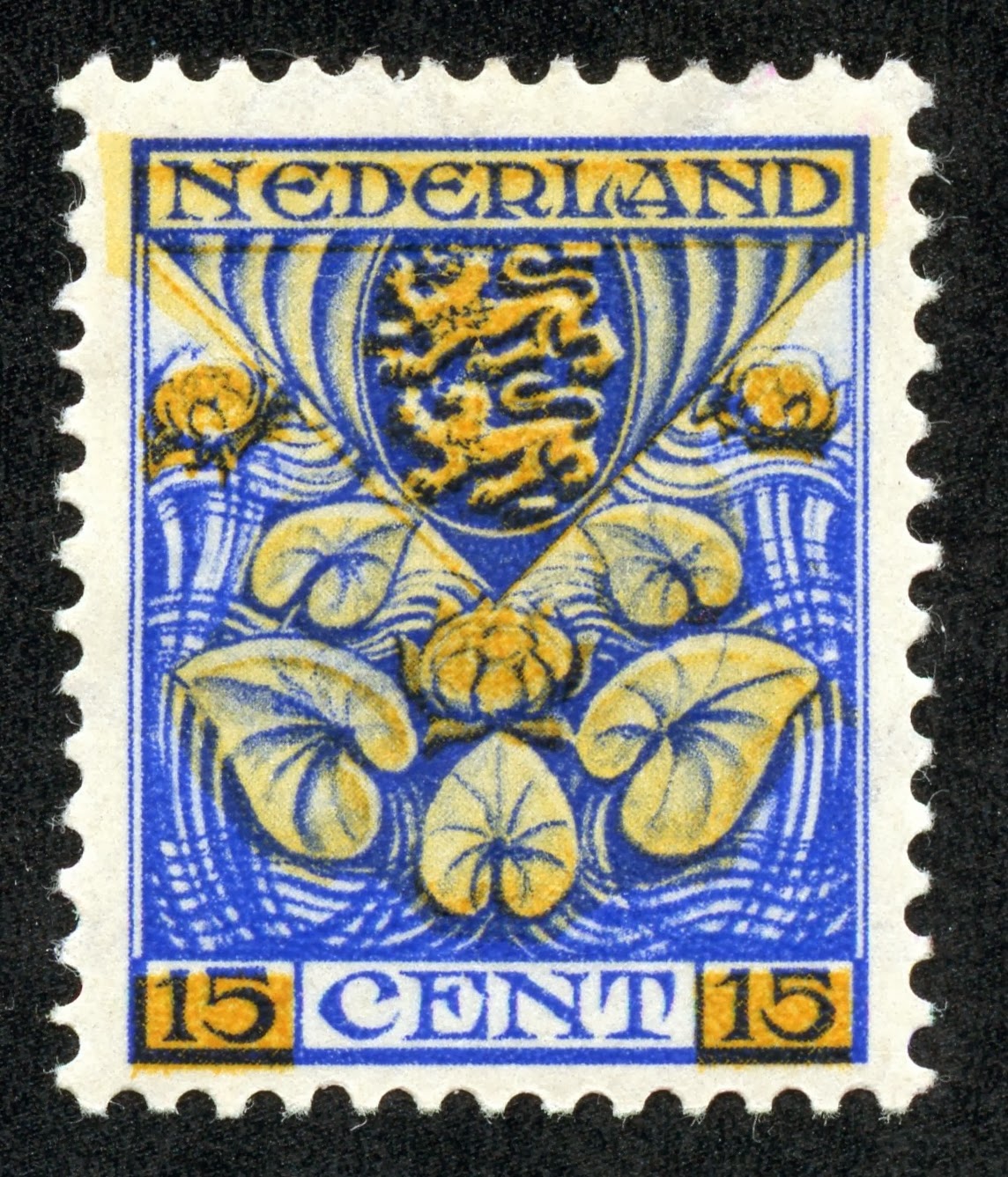
1926 Scott B15 15c (+3c) ultramarine & yellow
"Arms of Friesland"
Much like the Switzerland "Coat of Arms" semipostals, the Netherlands likewise had a set of stamps yearly between 1925-27 featuring "Arms" for various districts and towns. The surtax was dedicated for Child Welfare Societies. The sets were also issued as syncopated perforation varieties.
Here, an example is shown from the 1926 four stamp set. Stunning, No?
Here, an example is shown from the 1926 four stamp set. Stunning, No?

1927 Scott B20 15c (+5c) ultramarine & red
"Red Cross and Doves"
For the 60th anniversary of the Red Cross Society, a five stamp issue was released in 1927. This stamp has designs of doves outlined within the red cross. But look at the center of the design. I swear it has the image of the Nepal "Siva Mahadeva", a Hindu Deity. !

Nepal 1929 Scott 30 2p dark brown "Siva Mahadeva"
Is my imagination running away with this? ;-)

1928 Scott B30 10c (+2c) scarlet "Running"
The 1928 Olympic Games were held in Amsterdam, and the Netherlands released an eight stamp semipostal set to help defray expenses. No doubt this set was and is popular with the Olympic Games topical collectors. CV ranges from $1+-$10+.
Johnny Weissmuller (of Tarzan movie fame) won two gold medals in swimming, and Paavo Nurmi of Finland won his ninth gold medal in the 10,000 meter race.
Johnny Weissmuller (of Tarzan movie fame) won two gold medals in swimming, and Paavo Nurmi of Finland won his ninth gold medal in the 10,000 meter race.

1928 Scott B36 12 1/2c (+3 1/2c) ultramarine
"Christian Huygens"
In 1928, a four stamp portrait series was published for the benefit of Child Welfare Societies. Christian Hugens (1629- 1695) was featured on this 12 1/2c ultramarine stamp. Among his accomplishments, were the telescopic observations of the rings of Saturn, and the invention of the pendulum clock.

1930 Scott B41 5c (+5c) blue green
Rembrandt and His "Cloth Merchants of Amsterdam"
For the benefit of the Rembrandt Society, a three stamp set was released in 1930 with the drawing by Rembrandt (1606-1669) as above.
It is interesting that the drawing features Amsterdam merchants, as the Dutch were particularly adept at commerce.
It is interesting that the drawing features Amsterdam merchants, as the Dutch were particularly adept at commerce.

1930 Scott B46 6c (+4c) claret "Autumn"
"The Seasons"- four stamps representing the seasonal calender - was released in 1930, and dedicated for child welfare work. I like the old man of Autumn, getting long in tooth, carrying the possibility of rebirth- a new child.

1932 Scott B59 5c (+3c) red orange & ultramarine
"Cornflower"
A particularly lovely four stamp set was issued in 1932 showing different children and flowers- furze (gorse), cornflower, sunflower, and Christmas rose. Are the designs of today as lovely and poignant as these?

1933 Scott B64 6c (+4c) deep green
"Lifeboat in a Storm"
For the aid of Sailor's Homes, a four stamp set was produced in 1933. "Reddingswezen" means "rescue work".

1933 Scott B67 5c (+3c) dark brown & ocher
"Child Carrying the Star of Hope"
This four stamp set issued in 1933 might be considered one of the earlier Christmas themed designs. The "Star of Hope" is symbolical of Christmas cheer.

1934 Scott B72 6c (+2c) blue
"Dowager Queen Emma"
Queen Emma, the mother of Queen Wilhelmina, and her regent between 1890-1898, while Wilhelmina was still a child, is featured on this 1934 stamp. The surtax was for the Fight Tuberculosis Society. Queen Emma also died in 1934- I don't know if this stamp was for that purpose.

King William III and Queen Emma
The licentious old King- 41 years her senior- married her in 1879. But the marriage was reported as happy, and she did give birth to Wilhelmina in 1880, the King's eventual heiress presumptive.
Deep Blue

1928 Olympic Games issue in Deep Blue
There are some 133 semipostals issued up to 1940, and they are presented on 11 pages in Deep Blue. I noted in the first blog post on the Netherlands, that a number of issues had "syncopated perforations". This is true also for the semipostals. Deep Blue provides two pages for these minor varieties for the 1925-33 issues.

1929 Scott B39 6c (+4c) scarlet "Child on Dolphin"
Big BlueAs I mentioned in the first Netherlands post, Big Blue is exceedingly generous in its coverage of the semipostals- lacking only eight semipostals with the five page coverage. The good news is that Netherlands semipostals are not horribly expensive, with ten @ CV $10+, and one @ CV $20+. And true, many of the semipostals are in the $1+-$5+ range.
For a checklist of the semipostals, consult the first Netherlands blog post.
Now, what is this?

Feeder Big Blues and Deep Blue
Here's a pic of seven Big Blues (Albums or Country pages) getting fed into Deep Blue pages- the three ring binder on the front left. Good thing we have a spare bedroom, and my lovely Better Half lets me use it- No?
Both intriguing and horrifying. ;-)
Both intriguing and horrifying. ;-)

1934 Scott B73 1 1/2c (+1 1/2c) olive "Poor Child"
Out of the BlueSimply outstanding semipostal stamp designs from the Netherlands. Get some! ;-)
Note: Pic of Queen Wilhelmina, and pic of William III & Queen Emma appears to be in the public domain.
I like comments!
Jim,
ReplyDeletegreat post as usual. Never even realized the hindu god/doves; I thought it was a stylized flower of sorts.LOL.
Re the spare bedroom pic... Are house guests allowed to play with the albums;)
LOL
ReplyDeleteIt all gets put away when the kids and grandkids show up. ;-)
Thanks Keijo
The 'Dowager Queen Emma' engraving is absolutely incredible. And I love the simplicity of the 'Child on Dolphin' design. I'm partial to the 'Arms of Friesland', being a descendant of and having visited there.
ReplyDeleteThanks for sharing the snapshot of your 'method'!
David W
Pretty wonderful, I agree.
ReplyDeleteThanks Dave!
though not displayed here, I also like the semi-postal from 1931 (Scott B50-54), with very modern design and fonts that remind me of certain Bauhaus works...
ReplyDeleteThose stamps (B50-54) could have been issued in 1980! Yes, very modern in design.
ReplyDeleteThanks for the comment Filippo.
Jim, your last post on Swiss semi-postals brought me here. Just wondering how much attention you would have given to the Netherlands semi-postals - having a tradition almost equal to that of the Swiss. And yes, a full blog post. Nice work.
ReplyDeleteThe 1927 issue does indeed remind one of some Indian god/goddess. When you look at the center closely, you'll see that the figure is built up from six birds - just as they appear in the corners of the stamp. Nice detail I should think.
Having recently visited the Escher museum
Deletehttp://www.escherinhetpaleis.nl/
in Den Haag, I am struck by the similarities in his dove designs and the stamp. An imbedded Dutch graphic tradition?
Interesting connection, Jim. The stamp was designed by a C.L. Cachet, who was affiliated with the Amsterdam School - an Art Deco related style in the Netherlands - that was at its height in the 1920's. And the 1920's were the formative years of Escher.......
DeleteWhile revisiting some of these lovely Netherlands Semipostals, I noticed that my used set of B12-B15 (1926) has tiny glittery flakes (like mica) in the ink used for these stamps. Does anyone know whether this is typical feature for this issue?
ReplyDelete